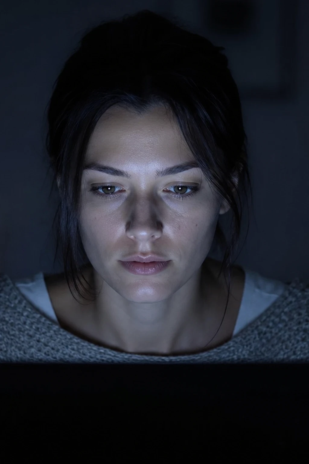
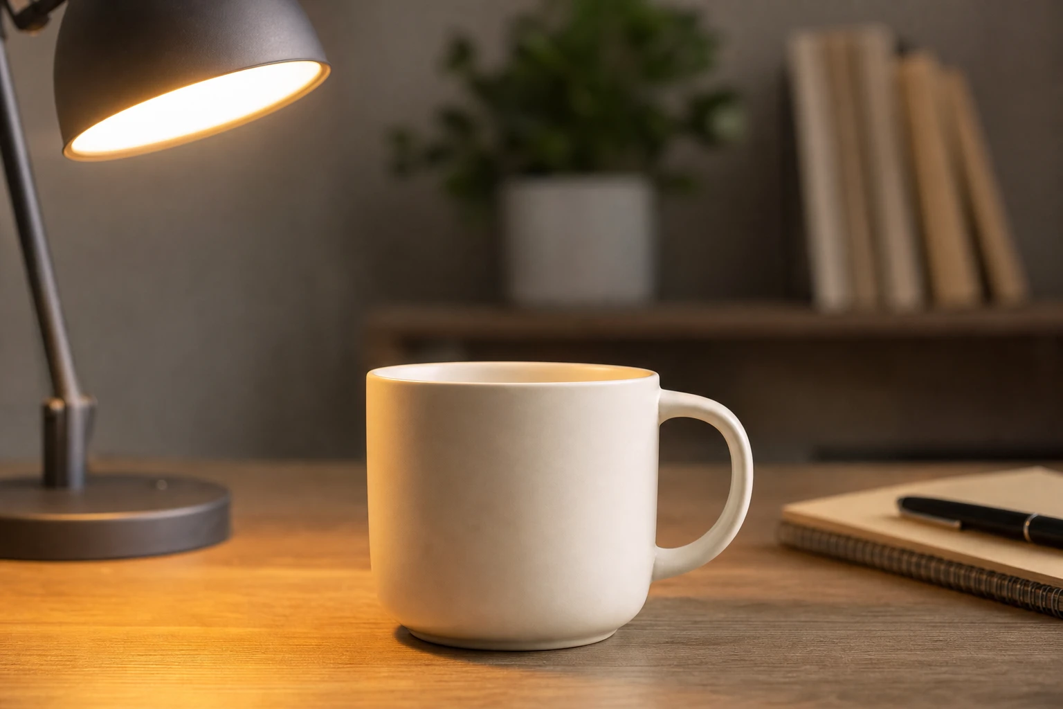
A practical is a light source that sits in the frame and motivates the look — a lamp, a screen, a lantern, a neon tube — rather than a studio strobe hidden outside the crop. The word is about story and direction, not about wattage: a practical can be the key, a dim accent, or pure set dressing, but the viewer reads it as belonging to the scene.
When it matters
Reach for practicals when the picture must feel like a place, not a seamless. Night interiors, interviews, product desks, and mixed-Kelvin rooms live or die on whether the glow in the frame matches the light on the subject. Skip a visible practical when the brief is pure studio abstract — a beauty dish on gray paper does not need a lamp in shot to “justify” itself.
Practicals also carry color temperature story. Warm lamp against cool window is a classic mixed-Kelvin read; screen glow against a tungsten floor lamp is another. The mixed Kelvin guide walks the placement; this page names the role.
How to read a practical in a photograph
Ask three questions:
1. Is it motivating the key, or decorating the set? In screen-glow practical portrait the laptop/phone glow is the face key — kill the screen and the exposure collapses. In bi-color panel night interior the panel is the working key while dim practicals hold depth in the room. In lantern group small room the overhead lantern wraps the group and visible lamps push the space back.
2. Does the catchlight or skin color match the source you can see? If the face is cool and the only lamp in frame is warm tungsten, something else is keying — a hidden LED, a window, a bounce. Honesty on set means the practical you show is either the real key or clearly secondary.
3. Is exposure built around the practical, or is the practical underexposed set dressing? A lamp that is two stops under the face reads as atmosphere. A lamp that matches the face is claiming key status — meter it that way.
Hardware in our tools library: practical lamp for desk and still-life motivation; lanterns and panels show up as modifiers on the setups above.
What people get wrong
Treating every practical as the exposure key. A pretty lamp in the background does not automatically light the face. If the face needs more light, add a hidden fill or raise the practical’s real output — do not pretend the glow on the wall is doing the work.
White-balancing away the story. Correcting a warm practical to neutral gray kills the mixed-Kelvin reason you put it in frame. White-balance for skin first, then decide how much of the lamp’s warmth stays in the grade.
Practicals that contradict the diagram. If the scheme shows a softbox camera-left but the only bright object in the photo is a lamp camera-right, the teaching layers disagree. Fix the light rows or move the practical — never leave the contradiction for the reader to discover.
Over-lighting the practical. Cranking a lamp until it clips into a white blob loses bulb shape and color. Dim it until the glass or shade still has tone; add a separate soft source for the face if needed.
In the library
Start with Screen Glow Practical Portrait (screen as key), Lantern Group Small Room (overhead wrap plus depth lamps), Bi-Color Panel Night Interior (panel key, practicals as room), and Practical Lamp Product Still Life (warm lamp in frame, neutral key from the other side — the second question, answered). For cutter/slash practical accents, see Cutter Slash Light — a motivated slash that is still a story light, not a softbox.